
PivotTables Beyond Sum: Percentages, Running Totals, and Multi-Measure Reports
Most PivotTable reports stop at the sum. But Excel’s PivotTable engine has a whole layer of built-in calculations that most people never touch. In this tutorial, we work through three exercises that show how to display values as percentages of the grand total, percentages of a parent group, and running year-to-date totals, all without writing a single formula. We also look at layout tricks that let us control exactly how those measures are organized on screen. By the end, we will have one PivotTable telling three completely different stories at the same time.
Exercise 1: Displaying Values as Percentages
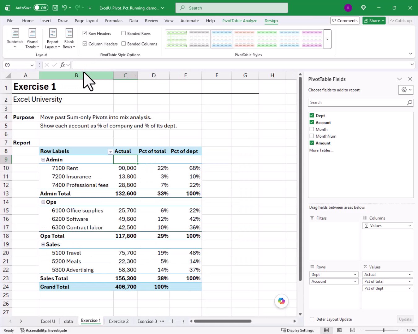
The goal of Exercise 1 is to move past a sum-only PivotTable and show each account as both a dollar amount and a percentage. We want to see what each account contributes to the company total AND what it contributes to its own department.
Let’s say we have the following source data with Department, Account, Month, and Amount columns:
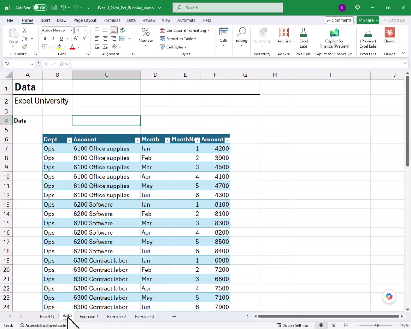
We click inside the table, go to Insert, PivotTable, and drop the report into an existing worksheet on the Exercise 1 tab. We place Dept and Account in the Rows area and Amount in the Values area. A quick right-click on the value field, Number Format, Number with no decimals and a comma separator, and we have our starting point:
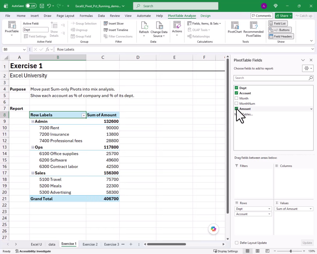
Now it is time to make things more interesting. We want a second column that shows each row as a percentage of the grand total. We cannot check the Amount field again in the field list because it is already checked. No worries, we can just drag it from the field list and drop it into the Values area a second time. Then we drag it a third time so we have three value columns to work with.
For the second column, we right-click any value cell and choose Show Values As, then % of Grand Total. Now each row shows its share of the company total.
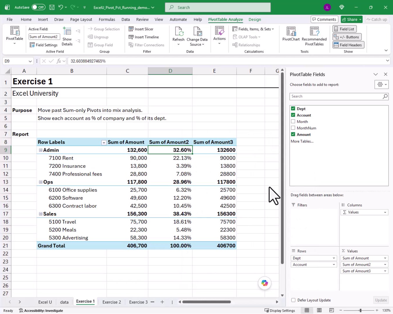
For the third column, we right-click and choose Show Values As, then % of Parent Row Total, selecting Dept as the parent. Now each account shows its share within its own department, and each department shows its share of the grand total.
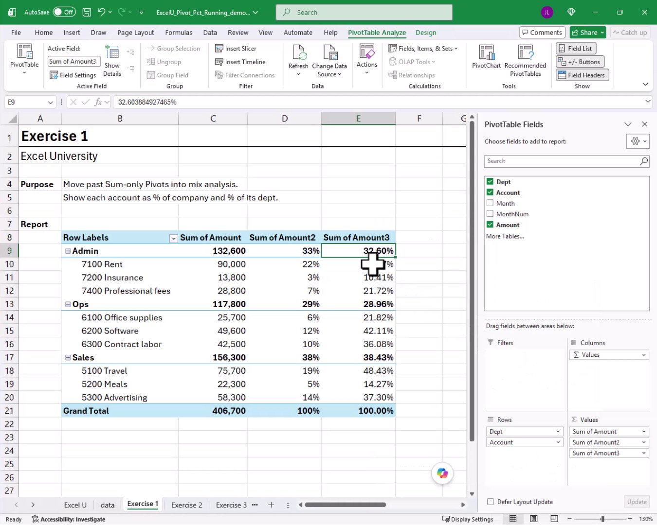
We rename the column headers directly in the PivotTable. We type Actual over the first header, Pct of total over the second, and Pct of dept over the third. We can give these any names we like.
One more polish step. The subtotals appear above the accounts by default, which can feel backwards. We head to PivotTable Design, Subtotals, Show All Subtotals at Bottom of Group. And bam:
Exercise 2: Building a Running YTD Total
Now that we have percentage columns working, it is time to tackle running totals. The purpose of Exercise 2 is to turn monthly amounts into a year-to-date story. We want to see the current period amount AND the cumulative total through that period, side by side for every month.
We insert a new PivotTable on the Exercise 2 tab. We place Dept in Rows, Amount in Values, and Month in the Columns area. We format the values with a comma and no decimals. We then drag Amount into Values a second time to create a duplicate column.
For the second column, we right-click a value cell and choose Show Values As. We can see all the options available:
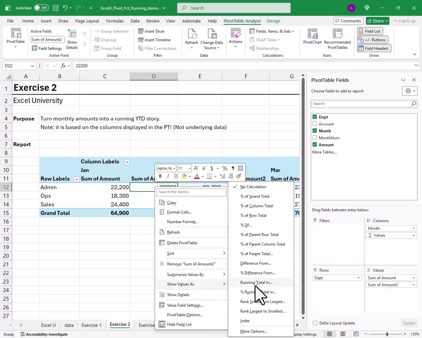
We choose Running Total In, select Month as the base field, and click OK. We format that second column with Number, no decimals, and a comma. We rename the first column Period and the second column YTD. And bam:
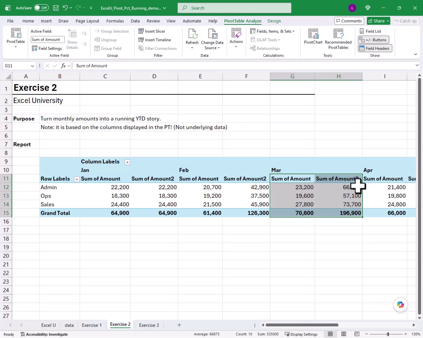
One important note. The running total is based on the columns displayed in the PivotTable, not the underlying source data. If we filter out January and February, the March YTD column will reflect only what is visible, not the full year-to-date from the raw data.
Layout Options for the Running Total Report
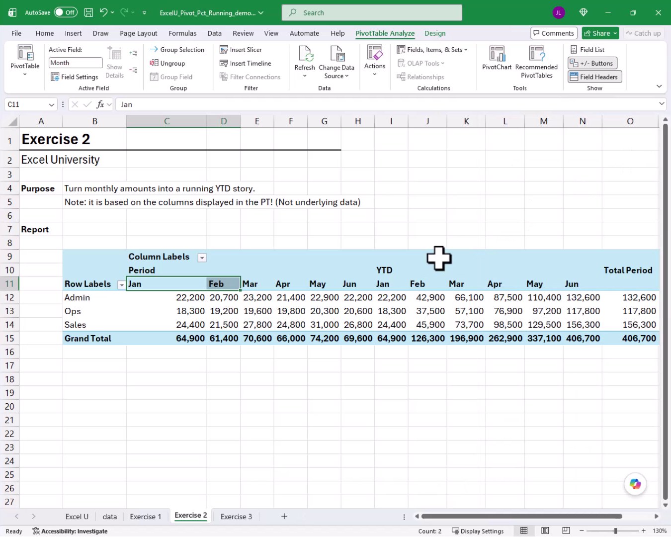
The default layout places the Values field below Month in the Columns area, so we get Period and YTD interleaved month by month. But we have more flexibility than that. We can drag the Values field above Month in the Columns area. Now all Period columns are grouped together on the left and all YTD columns are grouped together on the right:
We can also drag the Values field into the Rows area instead. Now each department shows a Period row and a YTD row stacked vertically, with months across the columns:
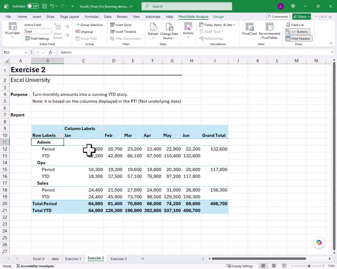
So those are a few different ways to display the running total layout. PivotTables are flexible, and we get to pick whatever arrangement works best for our audience.
Exercise 3: One PivotTable, Three Stories
With running totals and percentages both under our belt, let us bring this tutorial home with Exercise 3. The goal here is one PivotTable that tells three stories simultaneously: dollars, mix, and pace.
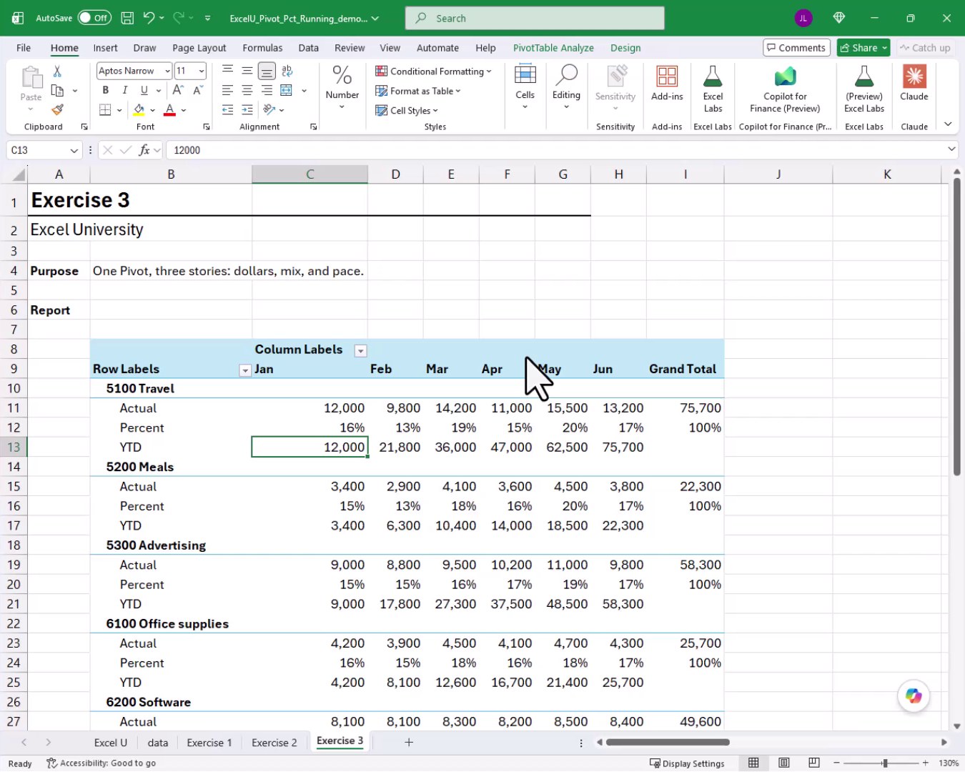
We insert a new PivotTable on the Exercise 3 tab. We place Account in Rows and Month in the Columns area. We drag Amount into Values three times. We move the Values field into the Rows area so each account shows three stacked rows. We rename them Actual, Percent, and YTD.
For the Actual row, we format with Number, no decimals, and a comma. For the Percent row, we right-click, choose Show Values As, and pick % of Parent Column Total. Because our layout has months in columns, the parent column total is each month’s grand total, so we get each account’s share of the monthly spend. We remove the decimals from the percentage format. For the YTD row, we right-click, choose Show Values As, Running Total In, Month. We format with Number, no decimals, comma. And bam:
Selecting All Rows of the Same Type at Once
Now we want to apply a gray font to all Percent rows to visually de-emphasize them. Clicking each Percent cell one at a time would take forever. There is a better way.
We move the mouse to the left edge of any Percent label cell until the cursor turns into a right-pointing arrow. We click once. Excel selects every Percent row across the entire PivotTable at the same time:
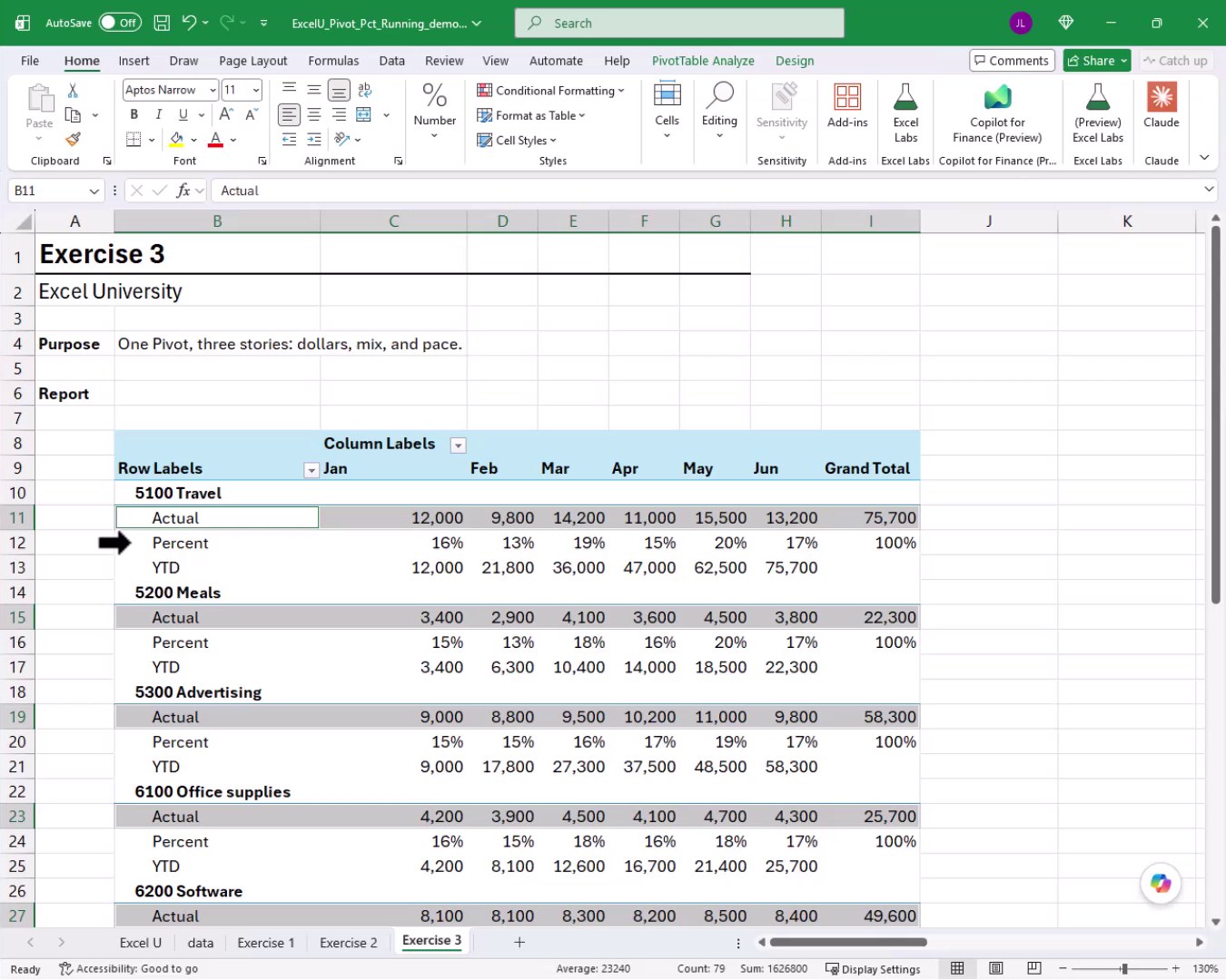
With all Percent rows selected, we right-click, go to Format Cells, and change the font color to gray. We click OK, and the result is a clean, readable report where the percentage rows are visually subordinate to the actual dollar rows:
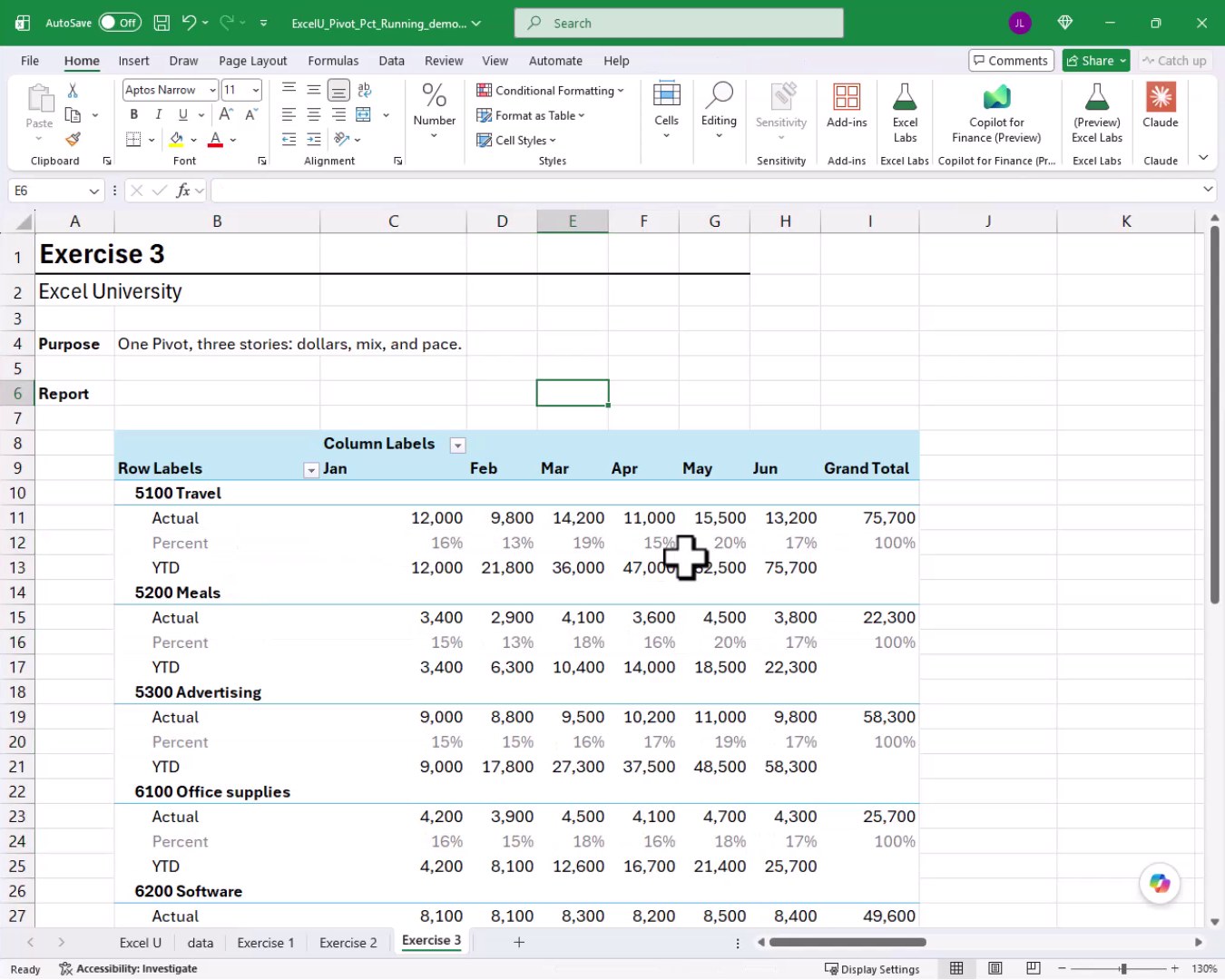
And that is how we can pack three analytical stories into a single PivotTable. Mission accomplished!
Summary
In this tutorial we saw how to go far beyond a basic sum in a PivotTable. In Exercise 1 we added duplicate value fields and used Show Values As to display % of Grand Total and % of Parent Row Total, giving us dollar amounts and two levels of percentage in one report. In Exercise 2 we used the Running Total In option to build a year-to-date column alongside period actuals, and we explored three different layout arrangements for those measures. In Exercise 3 we combined all three techniques into a single PivotTable showing Actual, Percent, and YTD rows per account, and we used the right-pointing arrow selection trick to format all rows of the same type in one click.
If you have any suggestions, improvements, alternatives, or questions, please share by posting a comment below … thanks!
Sample File
FAQs
Can we add the same field to a PivotTable’s Values area more than once?
Yes. Once a field has been checked in the PivotTable Field List it cannot be checked again, but we can drag the field from the list and drop it directly into the Values layout area as many times as we need. Each copy can then be configured with a different Show Values As calculation.
What is the difference between % of Grand Total and % of Parent Row Total?
% of Grand Total divides every cell by the overall grand total, so all rows in the report add up to 100%. % of Parent Row Total divides each child row by its immediate parent subtotal, so each group of children adds up to 100% within that group. Departments, for example, each show 100% across their accounts, and each department also shows its own share of the grand total.
What does % of Parent Column Total do?
% of Parent Column Total works the same way as % of Parent Row Total but operates on the column hierarchy instead of the row hierarchy. In Exercise 3, where months are in columns, choosing this option divides each account’s monthly amount by the column grand total for that month, giving us each account’s share of that month’s spending.
Is the Running Total calculated from the source data or from what is visible in the PivotTable?
It is based on what is displayed in the PivotTable, not the underlying source data. If we filter out certain months, the running total restarts from the first visible month. This is important to keep in mind when applying filters to a report that includes a YTD column.
How do we rename the column headers in a PivotTable?
We can simply click on the header cell and type a new name directly. The only rule is that the new name cannot exactly match an existing field name in the source data. Adding a space before or after the name is a common workaround if a conflict arises.
How do we move subtotals to the bottom of each group?
We go to the PivotTable Design tab on the ribbon, click Subtotals, and choose Show All Subtotals at Bottom of Group. This places the department subtotal row below the accounts rather than above them, which many people find easier to read.
What is the right-pointing arrow selection trick, and why is it useful?
When we hover over the left edge of a PivotTable row label cell, the cursor changes to a right-pointing arrow. Clicking at that point selects every instance of that label type across the entire PivotTable in one click. This makes it easy to apply consistent formatting to all Actual rows, all Percent rows, or all YTD rows without selecting them manually one by one.
Can we control whether Values appears in rows or columns in the layout area?
Yes. The Values field that appears in the Columns or Rows layout area can be dragged between those two areas freely. Moving it to Rows stacks the different value types vertically under each row label. Keeping it in Columns places them side by side within each column group. Both arrangements are valid depending on how much horizontal space we have and what is easiest for the reader.
Do these Show Values As options work in older versions of Excel?
Show Values As options including % of Grand Total, % of Parent Row Total, and Running Total In have been available since Excel 2010. The exercises in this tutorial do not require Excel 365, so they should work in any modern version of Excel.
Can we combine all three measures, Actual, Percent, and YTD, in a single PivotTable report?
Absolutely, and that is exactly what Exercise 3 demonstrates. We add the same field to the Values area three times, configure each copy with a different Show Values As setting, move the Values field into the Rows layout area so the three measures stack vertically under each account, and then format them independently. The result is one compact PivotTable that tells a dollar story, a mix story, and a pace story all at once.

Excel is not what it used to be.
You need the Excel Proficiency Roadmap now. Includes 6 steps for a successful journey, 3 things to avoid, and weekly Excel tips.
Want to learn Excel?
Our training programs start at $29 and will help you learn Excel quickly.