Geographic Heat Map
This is the fourth post in the Add-Ins series, where we are exploring various add-ins that enhance and extend the capabilities of Excel. In this post, we’ll take a look at the Geographic Heat Map add-in. In summary, it enables us to easily visualize data on a map.
Objective
Before we examine the details, let’s understand what the add-in does. Basically, it takes table data, such as the count of customers by state:

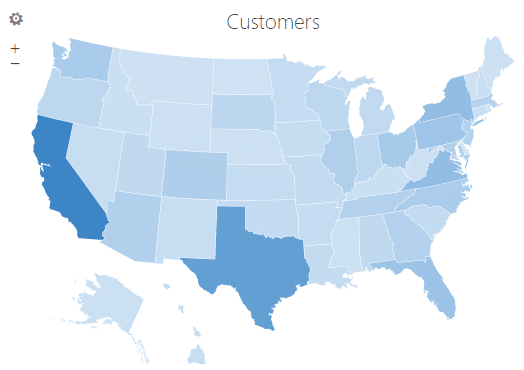
And then generates a corresponding display such as this:

Note: we previously discussed the Bing Maps add-in which uses points that vary by size to encode aggregate values. By contrast, the Geographic Heat Map add-in can color the geographical regions themselves to encode the values. This type of display is called a choropleth map.
App Store
The Geographic Heat Map add-in is available in the app store. To get to the app store, just click Insert > Get Add-Ins. Install the Geographic Heat Map add-in and you’ll be ready to go.

Note: depending on your version of Excel, you may or may not have access to these add-ins.
Example 1: Customers by State
Let’s say you have a table of data by geographic region. For example, population density, per-capita income, number of stores, or number of reps. In our illustration, we have the number of customers per state:

We click Insert > My Add-Ins > Geographic Heat Map:

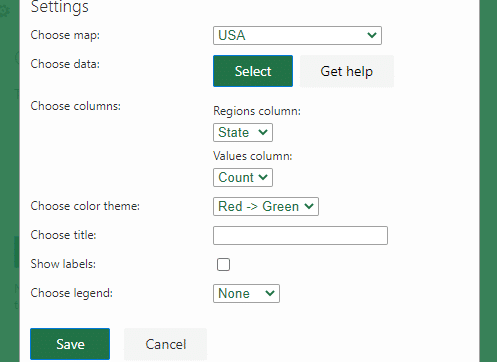
Since our data is already in a table, we click Get Started and are presented with the Settings screen:

Note: you can also use the Insert Sample button to have the add-in create a table for you.
In the Settings screen, we are able to choose a map, which includes options such as USA, World, Countries, and Continents.
Next, we use the Select button to choose the data source.
We can then specify which column contains the geographic regions and which contains the values.
We can also choose a color theme. The default Red -> Green looks like this:

We can also choose a Custom color theme and pick the desired colors:

The results are:

Other settings include title, labels, and legend.
Note: the geographic labels supported by the add-in are provided by clicking the Get Help button.
Example 2: Population
For this example, I downloaded the population for each country from the internet. The resulting table looks a bit like this:

After inserting the add-in into the worksheet, I was able to select the data range. This time, I selected World map from the settings screen and selected my custom color theme:

The resulting map:

Conclusion
As you can see, this add-in provides an easy way to generate geographic heat maps from data in an Excel table. It contains a good balance of simplicity, support for geographic labels, ease of use, and customization options. If you use any other add-ins, let me know by posting a comment below … thanks!
Sample File
Excel is not what it used to be.
You need the Excel Proficiency Roadmap now. Includes 6 steps for a successful journey, 3 things to avoid, and weekly Excel tips.
Want to learn Excel?
Our training programs start at $29 and will help you learn Excel quickly.

This is cool!
🙂