Visio Diagram from Excel Data
This is the third post in the Add-Ins series, where we are exploring various add-ins that enhance and extend the capabilities of Excel. In this post, we’ll take a look at the Microsoft Visio Data Visualizer add-in. In summary, it enables us to easily convert Excel data into a Visio diagram inside of Excel. It doesn’t include all of the powerful options and features of the full Visio application, however, for simple needs this provides a really nice option.
Objective
Before we jump in to the technicalities, let’s get a big picture view of what the add-in does.
Basically, we store the data in an Excel table, like this:

And the add-in generates a corresponding Visio diagram in our worksheet, like this:
There are several diagram layouts to choose from, and each has a corresponding data table structure.
App Store
The Visio Data Visualizer add-in is available in the app store. To get to the app store, just click Insert > Get Add-ins. Install the Microsoft Visio Data Visualizer add-in and you’ll be ready to rock and roll.

Note: depending on your version of Excel, you may or may not have access to these add-ins.
Example 1: Basic Flowchart
When we insert a Visio diagram (Insert > My Add-ins > Visio Data Visualizer), we’ll see something like this added to our worksheet:
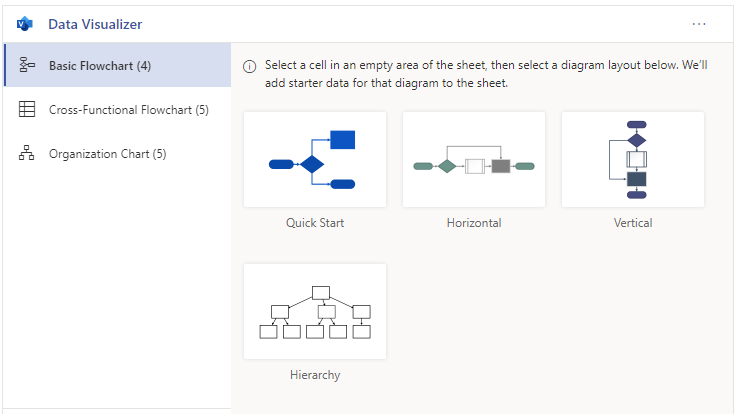
In this example, we select Basic Flowchart and can then select from one of several layout options. When we select the desired option, such as Vertical, the add-in will create a diagram AND insert sample data into a table in the worksheet. The table contains the columns and structure needed for the selected layout.
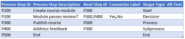
The data table contains the relationships needed to build the diagram. In addition, some columns offer drop-downs such as the Shape Type column:
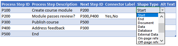
We are free to edit the sample data and create new rows as desired. When we refresh the diagram, it is updated accordingly.
The diagram includes an Edit button, but this will work only when signed into an account with appropriate permissions. We can use the slide-out menu on the right to reveal additional options, such as delete, select, or reload.
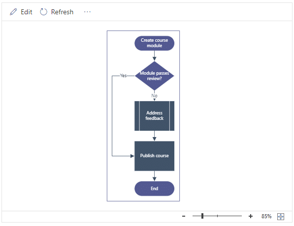
The basic flowchart above provides a diagram of the basic steps in the course process. But, what if we actually want to indicate who has responsibility for each of the steps in the flowchart? One option is to create a cross-functional flowchart.
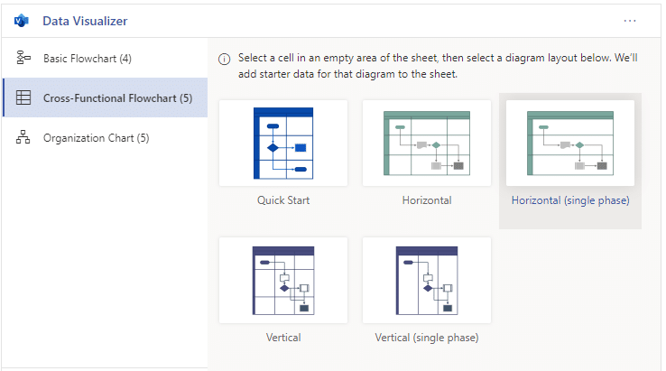
Example 2: Cross-Functional Flowchart
When we select Cross-Functional Flowchart, we have several layout options:
If we select Vertical, the add-in inserts a table with sample data into our worksheet like this:

We are free to make any changes to the sample data, including adding new data rows. The diagram will be updated accordingly.
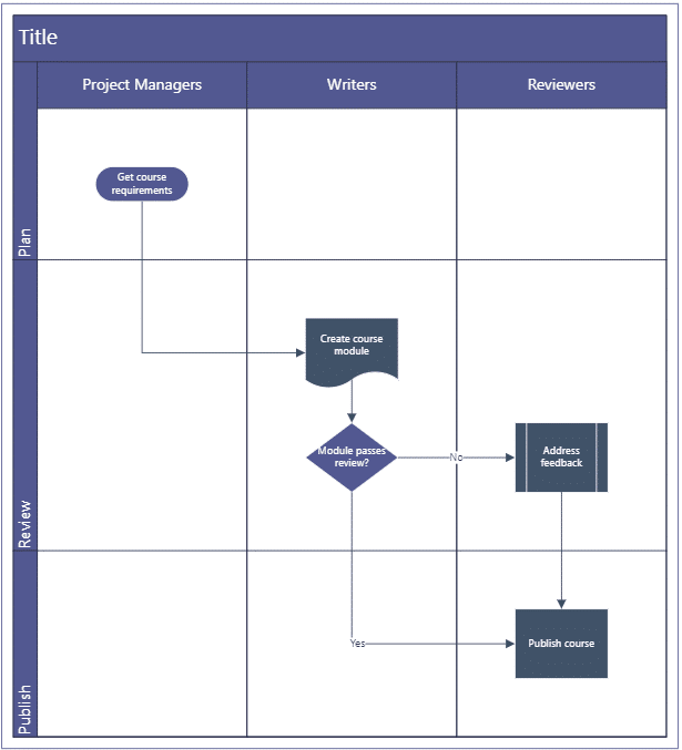
Now it is easy to see who is responsible for each of the steps in the process.
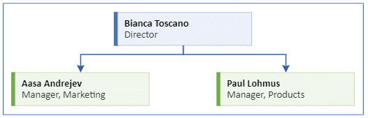
Now, what if we wanted to generate a diagram to indicate the specific people in our organization? One option is to create an organization chart.
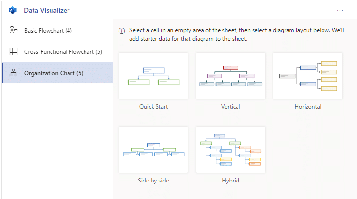
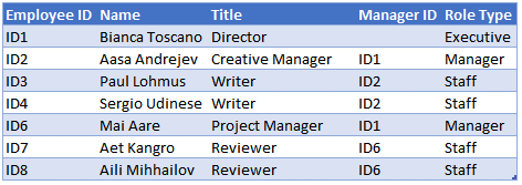
Example 3: Organization Chart
When we insert an Organization Chart, we have several layout options.
When we select Horizontal, the add-in inserts the corresponding sample data table.
We are free to add, edit, or delete items as desired. The diagram is updated accordingly:

Conclusion
As you can see, this add-in provides a relatively easy way to generate a visio diagram based on Excel data. If we desire more customization or features, we can use the full Visio application. But for fairly simple diagrams that fit within the basic diagram layouts offered, this can be a quick and convenient option. If you use any other add-ins, let me know by posting a comment below … thanks!
Sample File
Excel is not what it used to be.
You need the Excel Proficiency Roadmap now. Includes 6 steps for a successful journey, 3 things to avoid, and weekly Excel tips.
Want to learn Excel?
Our training programs start at $29 and will help you learn Excel quickly.
When initiating Data Visualizer an error occurs – “The add-in is not supported for the web browser you are currently using. Please try with a different browser”
Limitation: More than 100 lines can not be managed by Data Visualizer