Bar Chart Target Markers
Using target markers in a bar chart to compare a value (such as actual sales) to a target (such as budget or forecast) provides a clean display. As with anything in Excel, there are several ways to build such a chart. In this post, we’ll walk through a technique that does not require any calculated helper columns (the shadow technique). And, once you have created the chart and want to distribute it, a file sharing service like Dropbox can help.
Objective
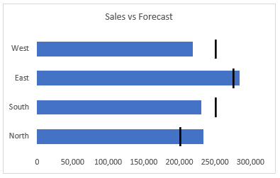
Let’s say we want to compare an actual value with a target value. There are many examples of this, including actual to budget, headcount to plan, sales to forecast, and so on. Rather than provide a bar for each, we can provide a horizontal bar for the actual value and a vertical marker for the target value, as shown below.
I’ve provided a short video and written a narrative below with the detailed steps.
This post is brought to you by Dropbox. Before we jump to the detailed steps, I’d like to thank our sponsor Dropbox. I’ve personally been a Dropbox user for over seven years. They provide many capabilities, including the ability to send large files … like large Excel workbooks! The next time you need to share your beautiful chart or Excel workbook, rather than emailing a large attachment, check out this service from Dropbox. It provides an easy way to send secure files and password protect them … without attaching huge files to an email.
Video
Narrative
We’ll build our chart by performing these steps:
- Insert clustered bar chart
- Set series overlap
- Format target series
Before we get to the steps, let’s take a quick look at the source data:
These are the exact values we’ll use in our chart, and, there are no additional calculations or helper columns needed.
The first step is to insert the chart.
Insert clustered bar chart
Select any cell in the data table and select Insert > Clustered Bar chart. We then remove the legend and gridlines, and update the title. At this point, our chart displays sales with blue bars, forecast values with orange bars, and looks a bit like this:
Now, we need to update the overlap.
Set series overlap
To change the Series Overlap, select either the sales or forecast bars and click Chart Tools > Format Selection. This opens the format panel, and you can use the Series Overlap slider or type in the desired value of 100% as shown below.
After changing the series overlap to 100%, the chart should look a bit like this:
Now, we just need to make a few formatting updates to the target series.
Format target series
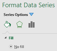
To format the target series, we select the target bars (in this case Forecast) and use the format panel. Under the Fill & Line category, we select No fill as shown below.
Next, under the Effects category, we set the Shadow Color to black (or other as desired). We are essentially using a shadow to create the marker, so, this technique is called the Shadow technique 🙂
We set transparency to 0%, Size to 100%, Blur to 0 pt, Angle to 0, and Distance to 2 pt as shown below.
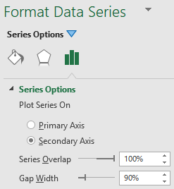
Next, under the Series Options category, we opt to plot the series on the Secondary axis, and adjust the Gap Width as desired.
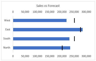
The updated chart is shown below.
At this point, we need to be absolutely sure that the primary and secondary axis scales are the same if we are going to display them both. Otherwise, the target markers won’t be in the right spot. If the primary and secondary axis scales are different, you’ll want to manually set them both by using Axis Options to set the Minimum bound to zero and the Maximum bound to be the same for both.
But, even easier, we can just delete the secondary axis labels just by selecting them and pressing the Delete key on our keyboard. When we do this, Excel uses the primary scale for both series – thanks Carlos B for the heads-up 🙂
And, our updated chart is shown below.
Yay … we did it!
Note: We can update the gap width for both the sales and forecast values to control the bar and marker heights independently as desired.
What about column charts?
If you are using vertical bars instead of horizontal, then, you’ll want to use an Excel Clustered Column chart instead of a bar chart.
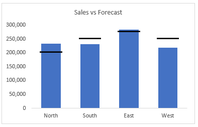
You can use the same steps as above, except, use a shadow angle of 270 instead of 0. This chart is shown below.
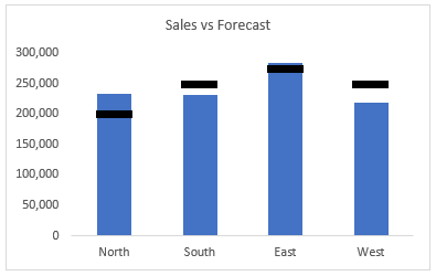
Or, an option that is easier to set up but provides less control over the target marker height and width is to use a line chart with markers for the target series. To accomplish this, change the chart type to Combo and plot the target series using a line chart with markers. Set the line to none, and use a built-in marker. If you use the horizontal bar marker and increase the size, the chart will look something like this:
The sample file below contains examples and steps for all three variations.
- Sample file: TargetMarkers.xlsx
In addition to plotting the sales and forecast values, there are other options for featuring this type of relationship, including plotting the variance directly. For more information about graph design, check out one of my favorite data visualization websites … or grab a copy of one of my favorite data visualization books Show Me the Numbers.
If you prefer other ways to create the vertical target markers in a horizontal bar chart besides the shadow technique, please share by posting a comment below … thanks!
Disclosures and Notes
- This is a sponsored post for Dropbox. All opinions are my own. Dropbox is not affiliated with nor endorses any other products or services mentioned.
- 100% of sponsor proceeds fund the Excel University scholarship and financial aid programs … thank you!
- If you’d like information on becoming a sponsor, please check out our sponsorship opportunities page.
Excel is not what it used to be.
You need the Excel Proficiency Roadmap now. Includes 6 steps for a successful journey, 3 things to avoid, and weekly Excel tips.
Want to learn Excel?
Our training programs start at $29 and will help you learn Excel quickly.




Bar Chart Target Markers
I love this solution – thank you! However, I need the categories (in this case Regions) to be presented in the same order as they are presented in the table. Horizontal bar charts automatically reverse the order. So when I reverse the category order, the markers no longer align correctly to the category. Anyway to accomplish this? Thanks!
Tim
Hi Tim! Since the markers are set on a secondary axis you have to update the “categories in reverse order” for both sets of axes so they’re the same. Then both sets of “bars” should be the same order.
Thank you!! Works for me.
This was so helpful. I’m having a problem getting the legend to show the target line. Any advice on that?
What you might want to do in order to keep the target line color in the legend is update each bar with no fill individually (one by one) instead of as a group of bars which deletes the legend color. Here’s a video using this technique. https://www.youtube.com/watch?v=EapRMY-vmKs
Wow, that was so easy! Thank you so much. I’d been working on trying to get target lines for hours before I found your video.
Glad it helped, and best of luck on your project 🙂
Hi all,
Thank you for this helpful page. Just one thing. If forecast=0 then the black bar disappears.
How is it possible to display this bar even for forecast=0 ?
Thanks in advance,
Lionel