AI Dashboards with Claude
Excel dashboards are essential for turning raw data into clear, actionable insights. But designing and populating a comprehensive dashboard can be time-consuming. The Claude add-in for Excel offers a powerful AI-based assistant that dramatically speeds up the process.
Video
Tutorial
In this walkthrough, we’ll explore how to use the Claude add-in to plan, build, and audit dynamic dashboards, ensuring our results are accurate and insightful every step of the way.
- Overview: The Power of the Claude Add-in for Excel Dashboards
- Step 1: Planning the Dashboard Layout
- Step 2: Building Dynamic KPIs and Charts
- Step 3: Auditing and Error Checking
- Summary & Best Practices
- Download Example File
- FAQs
Overview: The Power of the Claude Add-in for Excel Dashboards
Our scenario involves classic sales data and quarterly targets, structured in three worksheets:
- Data: Contains sales, order details, customer, region, and product information.
- Targets: Houses quarterly targets by region and product line.
- Dashboard: Blank worksheet where we’ll build our dashboard.
The Claude Excel add-in streamlines dashboard creation, automatically analyzing data and generating a tailored, interactive dashboard plan. This approach saves hours compared to manual design, while giving us full transparency to audit every result.
Step 1: Planning the Dashboard Layout with Claude
First, we install and activate the Claude add-in:
- On the Excel ribbon, click Add-ins, search for “Claude,” and install it. (Add-in is a free install; Claude account required to use.)
- Click the Claude ribbon button to open the Claude side panel.
Instead of brainstorming KPI placement and chart ideas manually, we let Claude analyze our data and propose a plan:
In the Claude panel, we enter a prompt like:
Plan a dashboard layout for the sales data. Suggest which KPIs, charts, and summary tables we should include and where they should go on the Dashboard sheet. Consider what a sales VP would want to see at a glance.
After Claude reviews our data and target sheets, it returns a detailed dashboard blueprint, complete with:
- A title bar
- KPI scorecards across the top rows
- Revenue versus target tables and charts
- Trends and mix analysis
- Product profitability deep-dives and operational metrics
This plan can be fine-tuned. Claude even prompts for time period and component selection to align with our needs.
Step 2: Building Dynamic KPIs and Charts Automatically
With our blueprint approved, we ask Claude to begin building the dashboard.
- Confirm the plan with Claude, specifying which KPIs or components to start with.
- Let Claude populate the Dashboard worksheet with scorecards, summary tables, and charts.
Here’s what we see:
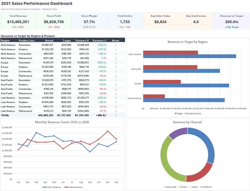
Notes:
- KPI cards up top, showing dynamic formulas for revenue, gross profit, gross margin, total orders, and average sale, using functions like SUMIFS and COUNTIFS that reference the Data and Targets sheets.
- Revenue vs. target tables by region with actuals, targets, variance, and % to target, fully dynamic, utilizing cell references and formulas rather than static values.
- Visually engaging charts, such as:
- Bar: Revenue vs. target by region
- Line: Monthly revenue trends (e.g., 2031 vs 2030)
- Bar: Revenue by channel
- Strategic use of conditional formatting in tables for instant visual cues.
The magic here is that formulas are transparent and auditable, we can double-click any KPI or table cell to review the calculation, rather than relying on static pasted values. This not only boosts trust but means updates to source data or targets are immediately reflected in the dashboard.
While some cosmetic adjustments might be warranted (formatting charts, repositioning elements), this instant first draft is a massive productivity boost.
Step 3: Auditing & Error Checking with Tie-Out Tables
Great dashboards must be accurate. Claude can help here too. We prompt Claude to build a Tie-Out Table (sometimes called an error checking or audit table):
- Ask Claude: “Build a table to check that dashboard KPIs tie back to source data.”
- Claude creates a comparison grid, showing the dashboard cell, an independent recalculation from the source data, the variance, pass/fail status, and notes for each KPI or metric.
- We use this to confirm every headline number on our dashboard is 100% accurate.
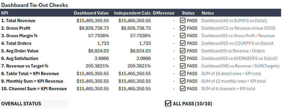
This feature automates what would otherwise be a manual, time-consuming audit process, speeding up validation so we can present results with confidence.
Summary & Best Practices
Using the Claude add-in for Excel, we can:
- Quickly generate a complete dashboard plan tailored to our data and audience
- Build out dynamic, formula-driven KPIs, summary tables, and charts in seconds
- Optimize our workflow, spending more time on analysis and less on manual setup
- Enhance accuracy with automated tie-out tables for error checking and audits
We always review and spot-check AI-generated results before sharing or presenting. Claude streamlines the heavy lifting, but expert oversight ensures the final dashboard is exactly as we need.
Whether reporting to sales leadership, marketing, or finance, this approach lets us deliver fast, interactive dashboards, freed up to focus on analytical insights and data-driven recommendations.
Download Example File
To accelerate your learning, download the sample Excel workbook used in this walkthrough. Explore the data, dashboard, and tie-out tables hands-on.
Frequently Asked Questions
- What is the Claude Excel add-in?
Claude is an AI-powered add-in for Excel that assists with data analysis, dashboard planning, and formula generation directly within the Excel interface. - Is the Claude add-in free to use?
The Claude add-in itself is free to install. Creating and using dashboards may require a free or paid Claude account depending on usage. - Can I customize the dashboard Claude creates?
Absolutely. All dashboard elements, KPIs, charts, tables, can be adjusted, reformatted, or rearranged after Claude creates the draft. - Do I need to know VBA or coding to use Claude with Excel?
Not at all. Claude uses natural language prompts and standard Excel formulas, with no coding or macro skills required. - Are the dashboards refreshable if my data changes?
Yes. Because Claude uses Excel formulas and references, updates to your data or targets flow through to the dashboard instantly. - How accurate are Claude’s calculations?
Claude uses Excel-native formulas. We recommend reviewing formulas and using tie-out tables to confirm all headline figures. - Can I use Claude with Excel Online or only in desktop?
Most features work in both desktop and Excel Online, but check the Office Add-ins store for the latest compatibility. - Does Claude support charts beyond bar and line?
Yes. Claude can generate various chart types per your prompt, including pie, scatter, and stacked charts, depending on your needs. - Can I automate periodic dashboard refreshes?
Since the dashboard uses formulas, any new data added to source tables is reflected automatically. You can also use Excel’s Refresh and recalculate actions for automation. - Is my data secure when using Claude?
Claude’s privacy policy governs how data is processed. For sensitive data, review terms and consider anonymizing before analysis.
Excel is not what it used to be.
You need the Excel Proficiency Roadmap now. Includes 6 steps for a successful journey, 3 things to avoid, and weekly Excel tips.
Want to learn Excel?
Our training programs start at $29 and will help you learn Excel quickly.