Excel University Blog
Read on for in-depth articles, tutorials, and videos. Search or browse for specific topics. Be sure to subscribe if you'd like to be notified when we write something new.
PIvotChart

Microsoft has just introduced one of the most impactful updates to PivotTables in recent memory: Auto Refresh. If you’ve ever relied heavily on PivotTables for financial reports, dashboards, or data summaries, this new feature is a game changer. In this guide, we’ll walk step-by-step through how to enable and use PivotTable auto refresh in Excel,…
Read More
When working with messy data, we often turn to Excel, but with the rise of AI tools like ChatGPT, we now have new ways to tackle these challenges. In this post, we’ll compare Excel and ChatGPT side by side, using three common data tasks: We’ll see how each tool handles the job, the pros and…
Read More
Creating an interactive Excel dashboard doesn’t have to be complicated. With just a few steps, we can transform raw data into a dynamic, easy-to-read report that updates automatically as new data comes in. In this guide, we’ll walk through the process of building an Excel dashboard using pivot tables, pivot charts, and a timeline filter.…
Read More
Are you ready to save hours of manual work each week? In this guide, we’ll explore how to automate your workflow in Excel using tools like Power Query, Pivot Tables, and Pivot Charts. Best of all, you don’t need to be a coding wizard to get started. By the end, you’ll know how to effortlessly…
Read More
Here’s the situation. We have created a PivotTable and related PivotChart, and, since we are nice, we have also provided a Slicer so that the user can easily make selections. But, we’d like the report titles to dynamically update based on the selections made. As with anything in Excel, there are multiple ways to accomplish…
Read More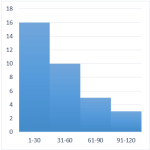
A histogram graphically displays the number of items that fall within equal intervals, or, bins. For example, the number of days with a high temperature between 71-80 degrees, 81-90, and 91-100, the number of students with test scores between 60-69, 70-79, 80-89, or the number of invoices that are due in 31-60, 61-90, or 91-120…
Read More