Create a Simple Dot Plot in Excel

Dot plots contain a series of dots, with each dot representing a single data point. They’re straightforward, easy-to-read charts that help you see trends and find any potential outliers in your samples. Creating a dot plot in Excel can be done in only a few steps which makes them a popular choice for displaying data!
Video
Start by preparing the data for your dot plot
The first step in creating a dot plot in Excel is to prepare your data. Your data should be in a table format with each row representing a single data point and each column representing a variable.
For example, let’s say you want to create a dot plot of the number of hours worked by each employee in a company. Your data might look something like this:
Use a line chart to create a dot plot in Excel
The next step is to insert a line chart. To do this, select your data and go to the Insert tab on the Excel ribbon.
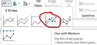
Click on the Line with Markers icon, which is located in the Charts group:

Excel inserts a basic line chart into your worksheet:

Now that you’ve inserted a basic chart, you can adjust it to create a dot plot.
Remove the Line
First, we need to remove the line that connects our dots. Double-click the line and in the Format Data Series panel select the No line option:

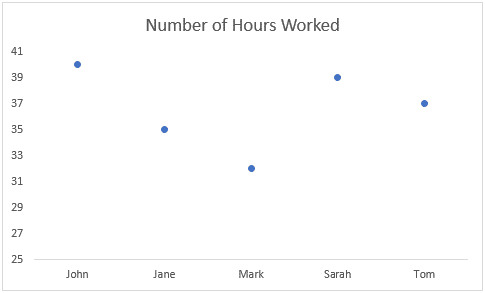
Bam:

Now that you have the basic dot plot chart, you can customize it to suit your needs.
How to customize a dot plot in Excel
You can edit the title of the chart by clicking on the Chart Title box and entering your desired title.
You may also want to change the style and size of the dots on the chart. You can access the options in the Format Data Series > Marker Options group after selecting the data series:

Remove Gridlines
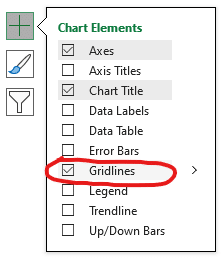
You can remove the gridlines by selecting the Chart Elements button and unchecking the Gridlines box.

Your updated chart will look like this:

You can also change the vertical axis to start/stop at specific values. To do so, use the Format Axis panel to specify the axis bounds as desired:

There are many additional formatting options you can use to display your dot plot as desired!
Whether you’re presenting your data to coworkers or analyzing it for your own purposes, a well-designed dot plot can help you identify patterns and trends that might be difficult to see in a table of raw data.
Do you have any tips for customizing or creating a dot plot in Excel? Let us know in the comments!
Sample File
Excel is not what it used to be.
You need the Excel Proficiency Roadmap now. Includes 6 steps for a successful journey, 3 things to avoid, and weekly Excel tips.
Want to learn Excel?
Our training programs start at $29 and will help you learn Excel quickly.
