
Tech Talk: Software Savvy
If you haven’t checked out Excel’s conditional formatting feature recently, you’re missing out on some nice enhancements. The feature formats a cell based on its value. Excel continuously monitors the cell value and updates the formatting as the cell value changes. Conditional formatting has traditionally been limited to basic cell formatting such as fill and font color, but, in modern versions of Excel, it can do much more. For example, it can create data bars, color scales and icon sets. In this column, we’ll talk about icon sets and how to customize them. Excited? Me too!
Standard Icon Sets
A conditional formatting icon set is a collection of related icons inserted into the cells based on pre-defined rules. For example, if the icon set has a green icon, a yellow icon and a red icon, Excel applies the icons to the cells based on the top, middle and bottom third of the values. Sets with four icons are applied in fourths, and sets with five icons are applied in fifths.
Applying standard icon sets is pretty easy. You simply select the range and then choose the desired icon set from the Home > Conditional Formatting > Icon Sets menu. For example, to help visualize our inventory turnover data, we select the turnover values and then apply the desired icon set as shown below.
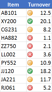
As you can see, the green icon is applied to the top third,the yellow icon is applied to the middle third and the red icon is applied to the bottom third. While the standard icon sets are great, we can have a lot more fun when we figure out how to customize them.
Custom Icon Sets
We can customize a few different settings, including thresholds. Instead of doing top, middle and bottom thirds, we could use top 10 percent, middle 80 percent and bottom 10 percent. We also can pick and choose the icons, reverse the icon order and opt to hide the cell value to show the icon only. These customizations are performed with the “Manage Rules” dialog box, opened with the Home > Conditional Formatting > Manage Rules icon.
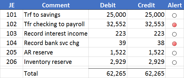
To demonstrate, let’s say we store our journal entry details in a table, and then compute a little journal entry summary as shown below.

The alert column computes the difference between debits and credits: When the difference is zero, that is good; and when the difference is not zero, that is bad. We want to graphically highlight the alert column though conditional formatting icon sets. When we apply a standard icon set to the alert column—for example,the 3 Traffic Lights icon set—we notice that when the value is 0 a yellow icon is applied, which is distracting. Also, we notice that a red icon is displayed when the value is -1, which is perfect, but a green icon is displayed when the alert value is 1. Since any non-zero difference is bad, we prefer a red icon rather than a green.
Therefore, we customize the conditional formatting rule by selecting the alert cells and then opening the “Manage Rules” dialog. We edit our icon set rule, and opt for a red icon when the value is greater than zero, a white circle icon when the value is greater than or equal to zero and a red circle icon when the value is less than zero. We also check the “Show Icon Only” checkbox so the cell values are hidden as shown below.

The updated journal entry summary is shown below.
The alert column is now clean and the icons make it easy to immediately understand which entries are out of balance. There are many interesting ways to customize the icon set rules, so feel free to explore the “Manage Rules” dialog. And remember, Excel rules!
Additional Resources
Excel is not what it used to be.
You need the Excel Proficiency Roadmap now. Includes 6 steps for a successful journey, 3 things to avoid, and weekly Excel tips.


