PivotTable Report Group Formatting
In this post, we’ll check out a few PivotTable formatting techniques that help get our report looking just right.
Objective
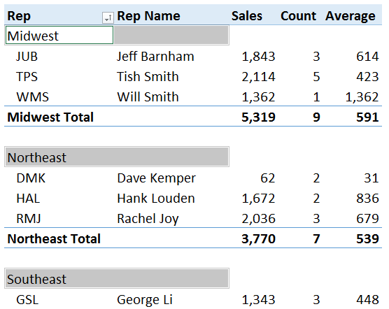
Our objective is to create the following PivotTable report.
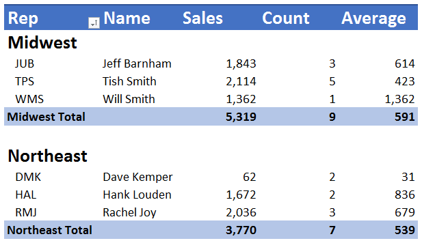
There are a few formatting points to note about the report. First, the region groups, such as Midwest and Northeast, are in the same column as the reps, but the rep names appear in their own column. Also notice the region group headers appear on their own rows with a non-standard font size (big and bold). Between region groups is a blank worksheet row. There are no +/- buttons. The sales, count, and average columns have numeric formatting. Region subtotals are presented under the region data. The report is sorted ascending by region, and within each region, by rep initials.
All of this formatting needs to remain intact each time the PivotTable is refreshed, even if new regions appear in the data source. If a new region such as East appears in the data next period, when we refresh the PivotTable we need the new region to appear with the custom region formatting (big and bold font) and it needs to appear in the correct alphabetical order. If there are new rows, the number formats need to be retained as well.
Now, let’s walk through the detailed steps to create it.
Details
The steps we’ll cover are:
- Define report structure
- Remove +/- buttons
- Define sort
- Tabular layout
- Remove subtotals
- Row headers
- Custom layout for region
- Custom region group formatting
- Column widths
- Design
Let’s begin by inserting the fields into the correct report area.
Define report structure
We select any cell in the data table, and then select Insert > PivotTable. We then insert the Region, Rep, and Rep Name fields into the Rows area. We then click-and-drag the Amount field into the Values area three times.
At this point, our little PivotTable looks like this.

Next, we need to fix the numbers so that they reflect the desired values. The first amount column, currently named Sum of Amount, needs to reflect the total sales amount. The values are fine but we need to change the report label. We simply type our desired column header Sales into the cell. To control the formatting, we right-click any value cell in the column and select Number Format (not Format Cells). We select number, no decimals, comma.
The next column, Sum of Amount2, needs to reflect the count of the number of transactions. So, we right-click any value cell in that column and select Summarize Values By…Count. We type our desired column label Count into the column header cell. We right-click any number in the column and select Number Format…number, no decimals, comma.
The next column, Sum of Amount3, needs to reflect the average sales per rep. So, we right-click any value cell in that column and select Summarize Values By…Average. We type the desired label, Average, into the header cell. We right-click any number in the column and select Number Format…number, no decimals, comma.
Lastly, we change the Row Labels header to Rep, and our updated report is looking a little better.

Remove +/- buttons
We need to remove the little show/hide, expand/collapse, +/- buttons. Fortunately, this is easy to do with the following ribbon icon:
- PivotTable Tools > Analyze > +/- Buttons
Ah, our report is looking a little better.

Define sort
Since the default sort of a PivotTable is Manual, and we want the sort to be ascending, even if new regions or reps appear in the data source in future periods, we need to explicitly define the sort order.
We select any region cell in the report, and then use the Rep drop-down and select Ascending. Next, we select any rep cell in the report and then use the Rep drop-down and select Ascending. We just told the PivotTable to sort ascending by region, and within each region, by rep. This is good so that as new regions or reps appear in our data source, they’ll automatically appear in the expected alphabetical order in the report.
Tabular layout
Now we need to change the report layout from its default, Compact, to Tabular. This is easily done by selecting the following ribbon command:
- PivotTable Tools > Design > Report Layout > Show in Tabular Form
We are getting closer…the updated report is shown below.

Remove subtotals
Next, we need to remove the rep subtotals, such as the JUB Total and TPS Total rows. To do so, we right-click any rep initials cell in the report, such as the JUB cell, and uncheck the Subtotal “Rep” item. The updated report is looking a bit cleaner now.

Row headers
To turn off the bold font for the region and rep values, we uncheck the following ribbon checkbox:
- PivotTable Tools > Design > Row Headers
Our updated report follows.
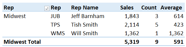
Custom layout for region
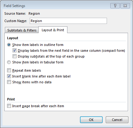
Next, we need to get the region group headers to appear on their own row. To do this, we’ll change the layout for the region field. We open the Field Settings dialog for the region field by right-clicking any region value, such as the Midwest cell, and then selecting the Field Settings item.
On the Layout & Print dialog tab, we opt to show item labels in outline form.

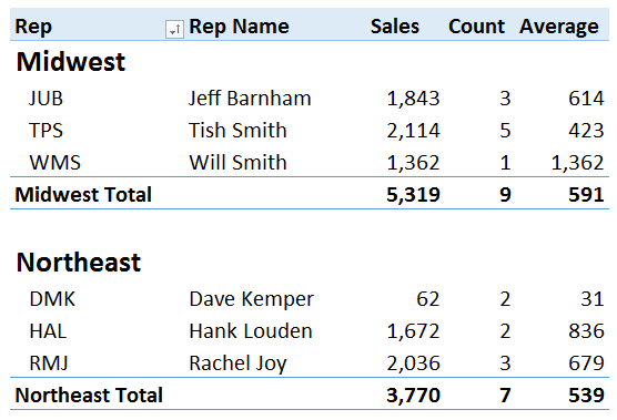
The updated report, which presents reach region group label on its own row, is shown below.

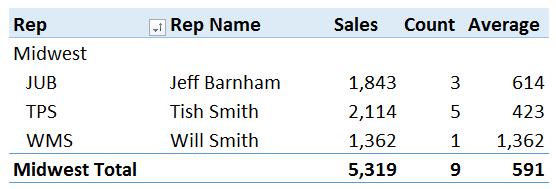
We place the region and rep fields into the same column by checking the Field Settings dialog’s Display labels from the next field in the same column (compact form) check box.

The updated report, which now includes region and rep in the same column, appears below.
We create the blank row between region groups by selecting the Field Setting dialog’s Insert blank line after each item label checkbox.
Custom region group formatting
Next, we need to create a non-standard format for the region rows. When doing so, we need to bear in mind that any future regions need to adopt this formatting automatically. To do this, we hover our mouse over the top cell border of any region cell, such as the cell that contains the value Midwest. When we hover the mouse near the top of the cell, the cursor changes to a down arrow. When it does, we click the mouse and all region cells will be selected, as illustrated below.
Now, any formatting we apply will be applied to all existing region cells and any future ones. We increase the font size and select bold, as shown below.
Column widths
Now, we want to create equal column widths, and prevent Excel from changing them each time we refresh the report.
After setting the column widths as desired, in our case, 12, we open the PivotTable Options dialog by selecting the following ribbon icon:
- PivotTable Tools > Analyze > Options
On the Layout & Format dialog tab, we uncheck the Autofit column widths on update checkbox.
Style
Now for the finishing cosmetic touches. We select the desired style from the following ribbon group:
- PivotTable Tools > Design > PivotTable Styles
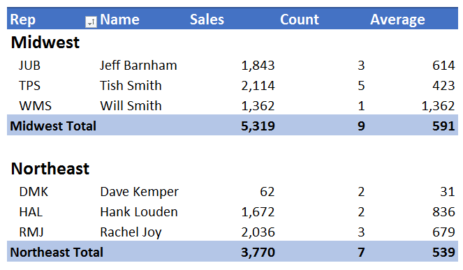
In our case, we select the Pivot Style Medium 13 icon.
Then, We change the Rep Name report label to Name, increase the font size for the header row, and change the header row font to bold.
The resulting report is shown below.
Now that we have dialed in the formatting using the steps above, the formatting will stay in place as we refresh the report, even if new regions or reps appear in a subsequent period. It is nice to be able to apply such specific formatting to PivotTable reports. The flexible formatting and layout options available help us get our reports to look just right.
If you have any other PivotTable formatting tips you’d like to share, please post a comment below…thanks!
Additional Resources
- Sample download file: PivotTableGroup
- Excel University Volume 3
Excel is not what it used to be.
You need the Excel Proficiency Roadmap now. Includes 6 steps for a successful journey, 3 things to avoid, and weekly Excel tips.
Want to learn Excel?
Our training programs start at $29 and will help you learn Excel quickly.
This is absolutely great. Solves problem with default Design layout options. Bookmarking this excellent guide.