How to Make an Excel Dynamic Chart & Keep Updates Consistent

For the purposes of this discussion, an Excel dynamic chart is a chart that automatically updates itself whenever new data rows are added. The opposite is a static chart, which won’t incorporate any new data rows added to the existing range.
To be clear, when Excel creates a chart based on a range of cells, if the cell values within that range change, both types of charts will update accordingly. However, we are talking about what happens when we add new data rows under the existing range used by the chart. In other words, if we add new data rows, a dynamic chart will dynamically update its range and incorporate the new row values. A static chart won’t.
The Issue We Are Solving
For our data set, we’ll include careers that require Excel skills and document their average national salaries. Let’s say we store this data in an ordinary range, like this:
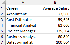
We select any cell in that range, and use the Insert > Chart command. Excel creates a basic chart like this:
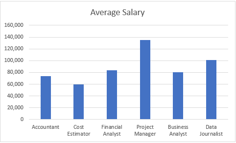
Later, we want to add one more career. So we type it into a new row under the range, like this:

When we look at our chart, nothing changed:

In other words, our new data row was excluded. We’d rather build a chart that dynamically updates its range to include any such new rows.
Video
The Two Ways to Create a Dynamic Chart in Excel
Ultimately, the goal is to tell Excel that the data source is a dynamic range – that way, the chart will automatically update to reflect any additions (and changes) made to the source data.
We’ll look at two ways to accomplish this: using a table or a fancy formula. Using a table is the simplest option and works in most situations, so let’s start with that!
Creating a Dynamic Chart Using a Table
Rather than storing our source data in an ordinary range, we want to store it in a Table. How do we do that? Easy. We simply select any cell within the ordinary range and use the Insert > Table command.
Excel will convert the ordinary range into a Table, and apply some default formatting:
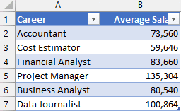
Now, the great thing about Tables is that they auto-expand. So, after we select any cell in the Table we can insert our chart with the Insert > Chart command. Again, we have our basic chart:

But now, when we type a new value immediately under the Table, the Table automatically expands to include it:

This time … our chart automatically includes the new row … bam:
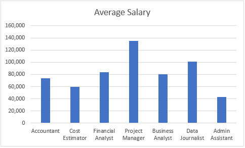
Whenever we add new rows to the Table, our dynamic chart will update automatically!
Creating a Dynamic Chart Using a Formula
The problem with using the table method is that not all versions of Excel have the same capabilities. Creating a dynamic chart in Excel is a little trickier with a formula but still very possible.
The formula will use both the OFFSET and COUNTA functions, so if you’re looking to get some practice with those, a dynamic chart is a great starting point!
This example will use the same data as before, but stored in an ordinary range:

1. First, create a Named Range by navigating to Formulas on the ribbon and selecting Name Manager.
2. After the Name Manager dialog box pops up, select New.
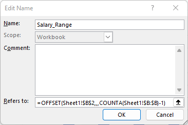
3. The New Name dialog box will appear. Now enter Salary_Range into the Name field. Then, copy/paste (or type) the formula below in the Refers to box (replace Sheet1 with your worksheet name, $B$2 for your first number cell, and $B:$B for your numbers column).
=OFFSET('Sheet1'!$B$2,,,COUNTA('Sheet1'!$B:$B)-1)
4. Hit OK.
5. Select the New command once again.
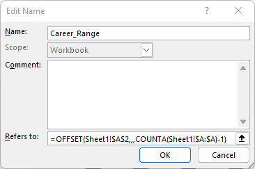
6. This time, enter Career_Range in the Name field and insert the following formula in the Refers to section (use your sheet name, and column letter that references the label column):
=OFFSET('Sheet1'!$A$2,,,COUNTA('Sheet1'!$A:$A)-1)
7. Hit OK.
Once these names are set up, they will dynamically update the ranges they reference. In a bit, we’ll use them in our chart, but, let’s talk about the formulas in more detail first.
What’s Happening in the Formula?
When creating your chart, it helps to know why the above formulas work. The OFFSET function is used in this formula to create a range that automatically changes in height depending on the number of non-empty cells (provided by the COUNTA).
Note that, for this reason, the OFFSET formula will not work properly if your chart has empty cells.
The first argument represented by the OFFSET function is cell $B$2, which is an absolute reference to the starting point of the salary range. That is, the first numeric cell.
We use COUNTA for the height argument. We point it to the column that includes the values we are counting. If our first row in the column includes a header label, such as Career or Average Salary, we exclude it from the chart range by entering -1 to subtract one from the count.
Now, Use Your Named Ranges to Create the Chart
1. Select Insert from the ribbon menu. Then select the chart you’d like to use (this example uses a simple 2D Column Chart).
2. Go to the Chart Design tab and choose Select Data.
3. The Select Data Source dialog box will appear. Under the Legend Entries (Series) section, select the Add button.
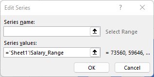
4. Type the formula below in the box’s Series values field, then press OK.
='Sheet1'!Salary_Range
5. Return to the Select Data Source dialog box. You’ll see Horizontal (Category) Axis Labels in this dialog box. Select Edit button.
6. Another dialog box called Axis Labels will then pop up. Enter the formula below in the Axis label range box and then hit OK.
='Sheet1'!Career_Range

Give your chart a title and your dynamic chart is complete!

Just like before, you can insert additional rows and the chart will update automatically.
In the majority of situations, creating a dynamic chart using a table is more efficient and just as effective as using formulas and named ranges. But, it’s always useful to practice and expand your Excel knowledge along the way.
Sample File
Do you have any additional tips for creating dynamic charts in Excel? Let us know in the comments!
Excel is not what it used to be.
You need the Excel Proficiency Roadmap now. Includes 6 steps for a successful journey, 3 things to avoid, and weekly Excel tips.
Want to learn Excel?
Our training programs start at $29 and will help you learn Excel quickly.

Thank you!
What about if you are using formulas to insert the data? I have 100 rows of data currently. all with formula in them. Lets say only 50 are currently displaying anything and the rest are all blank. How do I create a graph that will only show the 50 populated values? Then if the data updates and I end up with 60 rows, I want the table to obviously show those additional 10 rows. and the same if the number of rows displaying values goes down.
If it helps, in my example there will be no random blank rows within my data set, the first row will always have data and all data will be presented from row 1 down. All blank rows are at the end of my dataset.
hello , did you manage to fix this ?