Heat Maps in Excel
In this post, we’ll recreate a heat map presented in Stephen Few’s Information Dashboard Design, 2nd Edition, using an Excel PivotTable and a bit of conditional formatting.
Objective
Before we get too far, let’s take a look at our objective. We are trying to create a heat map that uses variation in color intensity to represent value ranges. The image below is a partial heat map that shows alcohol consumption by country for the year 2010, and I downloaded the data from the World Health Organization’s (WHO) website today using the link provided below.

There are 3 main steps to creating this heat map in Excel.
- Create the basic PivotTable
- Apply conditional formatting
- Format the PivotTable
Let’s take them one at a time. The steps below are demonstrated using Excel 2013 for Windows.
Create the basic PivotTable
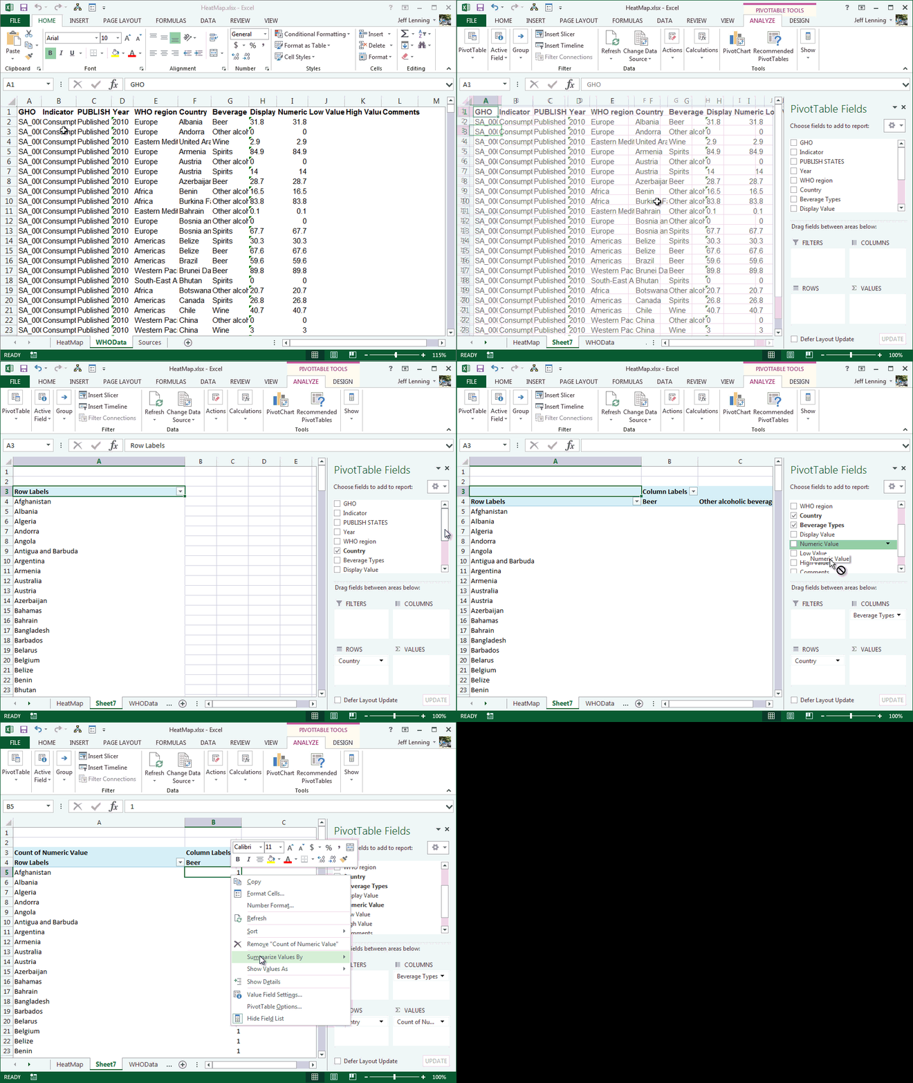
Before we create the PivotTable, let’s take a quick look at the data that I downloaded from the WHO website. The columns we’ll need for our heat map are Country (Column F), Beverage Types (Column G), and Numeric Value (Column I).
To create the PivotTable, select a cell within the data range and click the Insert > PivotTable Ribbon icon. Place the PivotTable on a new or existing worksheet as desired. Then, insert the Country field into the Rows area, the Numeric Value field into the Values area, and the Beverage Types field into the Columns area. Then, if Excel happens to default to using the Count function for the Numeric Value field, change the function to Sum by right-clicking any value field cell and selecting Summarize Values By…Sum. All of these steps are illustrated below.
Now that the basic PivotTable exists, we need to make a couple of easy modifications to the structure.
First, we remove the report totals by selecting PivotTable Tools > Design > Grand Totals > Off for Rows and Columns.
Then we filter out any countries with missing data by clicking the row labels drop-down and selecting Value Filters > Greater Than. In the resulting Value Filter dialog, we tell Excel to show items for which the sum of the Numeric Value field is greater than 0, as shown in the screenshot below.
We get the columns into the desired order by clicking the column labels and dragging them into position, as shown below.
We update the sort order by clicking a cell in the Spirits column and clicking the Data > ZA Ribbon icon.
We change the column label “Other alcoholic beverages” to “Other” by typing “Other” into the column label cell.
The resulting PivotTable report is shown below.
Now that our basic report structure is looking good, let’s apply the heat map colors with conditional formatting.
Apply Conditional Formatting
The conditional formatting feature formats a cell based on its value. In our case, we’d like to apply cell fill colors based on the following ranges:
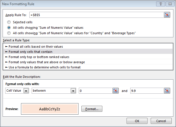
To do so, we repeat the following step 5 times, once for each range. Select any value cell in the PivotTable and select Home > Conditional Formatting > New Rule. In the resulting New Formatting Rule dialog, we tell Excel to apply the rule to All cells showing “Sum of Numeric Value” values and Format only cells that contain a Cell Value between the desired range values. We click the Format button to set the cell fill to the desired color AND to create a white cell Outline border.
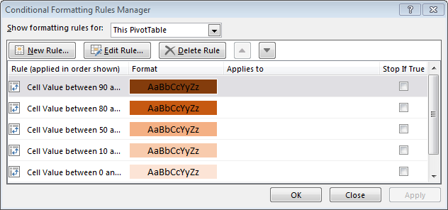
We repeat that step until we have five individual conditional formatting rules, as illustrated in the Conditional Formatting Rules Manager dialog shown below.
At this point we feel pretty good because we can see the heat map taking form, as shown in the resulting PivotTable below.
All that remains is to apply a few cosmetic touches.
Format the PivotTable
We clean it up by completing the following formatting tasks.
- Uncheck the PivotTable Tools > Design > Column Headers checkbox
- Change the style by clicking the PivotTable Tools > Design > Pivot Style Light 15 (or other preferred style)
- Toggle off the PivotTable Tools > Analyze > Field Headers
- Replace the report label “Sum of Numeric Value” with a space
- Center and format the column header cells with bold font
- Tell Excel to stop resizing our column widths by unchecking the PivotTable Options > Autofit column widths on update checkbox (click the PivotTable Analyze > Options icon to open the PivotTable Options Dialog Box)
- Set the worksheet column widths as desired
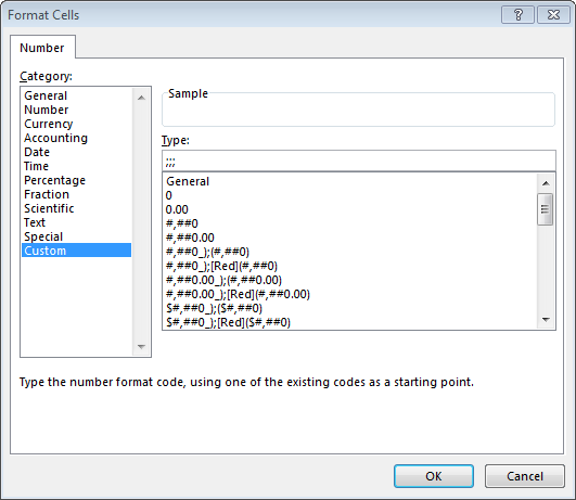
- To hide the display of the cell values, right-click any value cell and select Number Format (not Format Cells)…and in the resulting dialog set the Number format to Custom type ;;; (shown below)
Excellent…we achieved our objective and the resulting report is exactly what we wanted!
Thanks to Stephen Few for writing Information Dashboard Design and for granting permission to recreate this heat map!
Other Considerations
- Since the heat map was built with a PivotTable, it is easy to update anytime. We just export updated data and paste it into the Data worksheet. We activate the PivotTable and select the PivotTable Tools > Change Data Source icon to ensure that all data rows are included in the report.
- Note, in practice, it would be a good idea to store the underlying data in a Table (Insert > Table) and then create the PivotTable using the Table’s name to ensure new data rows are automatically included. Refresh the PivotTable to retrieve any updated values from the table, including any new rows.
- In practice, it would be a good idea to store the range values in worksheet cells rather than entering them into the conditional formatting rule. This would make it easy to quickly change the color ranges without needing to update the conditional formatting rules.
Additional Resources
- Sample file: HeatMap
- Information Dashboard Design: http://www.amazon.com/dp/1938377001
- World Health Organization (WHO) website: http://apps.who.int/en/
- WHO Downloaded data webpage: http://apps.who.int/gho/data/node.main.A1023?lang=en
Excel is not what it used to be.
You need the Excel Proficiency Roadmap now. Includes 6 steps for a successful journey, 3 things to avoid, and weekly Excel tips.
Want to learn Excel?
Our training programs start at $29 and will help you learn Excel quickly.


The tutorial on heat maps was really useful for me.
I am using MS office 2010.
I have few queries.
The instructions on how to store the underlying data is not clear to me.
I would like to know whether the color bar with ranges can be displayed automatically at the side of the pivot table for better understanding the ranges of the values used (Like a color bar in any surface maps)
Shall appreciate if you can answer my queries
Thanks and regards
Miss Madhubala Talaulikar
Madhubala,
If you want to display the colors to the right of the numbers, you can do so by placing the Numeric Value field into the Values area of the PivotTable again, and then inserting the Beverage Types field into the Columns area under the Values field. This arrangement is illustrated in the screenshot below.
Colors to Right of Data
Thanks,
Jeff
This is very helpful, thank you. Now that I have the pivot table with color functions set up, is there a way I can easily transfer the data to a USA map? There is a lot of information online but I am stuck..
Thanks,
Manuel
Microsoft provides the ability to visualize geographic data, yes, and you’ll want to check out Excel’s Power Map add-in or if you have Excel 2016 for Windows this capability is built-in.
Good luck…sounds like a cool project!
Thanks
Jeff
Thanks Jeff. This is exactly what i needed and in a very well written instructable. Very much appreciated!
Thanks for this well written tutorial.
But once I have made this heat map how do I display a scale that helps people relate some sort of numeric value to the data?
Thanks,
Vish
the scale would just be manually created. The PivotTable would update every time but the color-scale would remain.
This tutorial was so helpful! I was trying to do the same thing using Matlab and I didn’t have desired version. On excel it was much faster. Thanks